A New Look for CCMA - Same Mission, More Movement
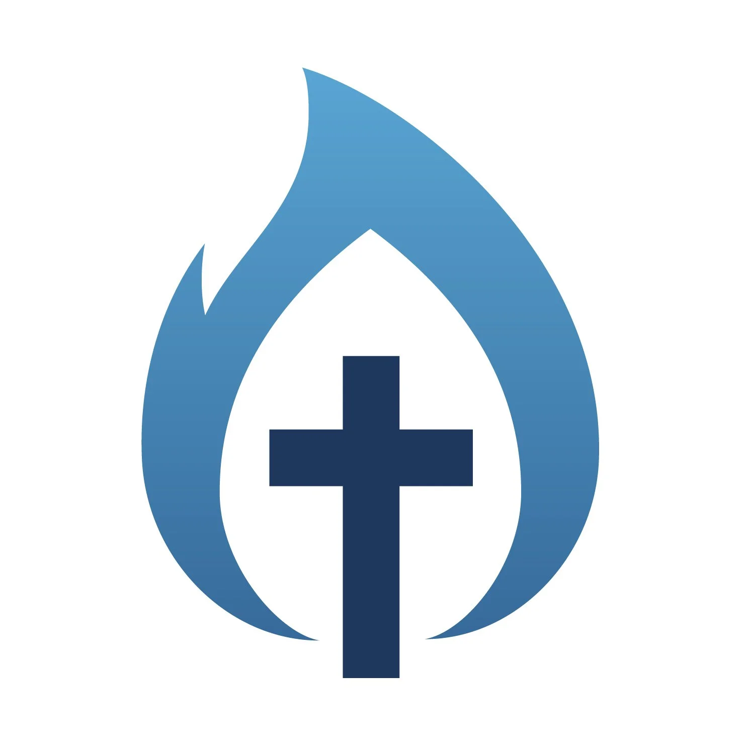
For over two decades, the CCMA logo has carried the same core symbols: a cross and a flame, rendered in blue and green. Those elements aren't changing. What's changing is how they're drawn and what they're being asked to say.
The cross and the flame stay. The shades of blue and green shift, and we're adding a true gold. Here's why.
Christ stays at the center.
Before anything else, the cross. It isn't moving, and it isn't shrinking to make room for the flame, it's the still point everything else moves around. Campus ministry only works because Christ is at the center of it. The energy, the outreach, the formation, none of it means anything if it isn't anchored to Him. The flame can move freely in this mark precisely because the cross holds steady. That's also a fair description of what we're asking of every campus minister: go out, be sent, set the world on fire but stay rooted in the One who sends you.
The flame has always meant something specific.
St. Catherine of Siena said it best: "Be who you were meant to be, and you will set the world on fire." That's not a decorative idea for us, it's the job description. Campus ministry doesn't ask students to wait until graduation to live their faith. It asks them to become who they're called to be right now, in the middle of dorm rooms and dining halls and 11pm conversations. And that becoming has a way of catching. Our flame has always pointed to that.
In the refreshed mark, the flame carries more movement than it has before, and that's intentional. Fire isn't static. It travels, it spreads, it changes the shape of whatever it touches. That's a fitting picture for an apostolate that exists to reach every student on every campus, not just the ones who already walk through our doors.
Why blue at the center.
If you've ever looked closely at a flame, you know the visual cliché, orange and red on the outside, isn't actually where the fire is hottest. The blue at the core is the hottest point. We kept blue close to the center of this mark for that reason. CCMA isn't on the edge of the Church's work with young people; we're at the center of it, in the heat, where the most formative decisions of a student's life are actually getting made.
Gold, added.
The new palette introduces a true gold alongside our blue and green. You won't find it in the mark itself, the cross and flame stay true to blue, but it now sits alongside the mark in the wider palette, the family of colors that carries CCMA's look everywhere the mark travels: materials, backgrounds, the visual world built around it. Gold has long signified what's set apart, sacred, and worth investing in, sanctuary doors, chalices, the glow behind a saint in an icon. It's also, not coincidentally, the color of harvest. Campus ministry is sower's work: most of what's planted in a four-year window isn't seen in full until long after a student leaves campus. Gold reminds us we're standing in a long story, not just a semester.
Green, deepened.
Green isn't new to CCMA's identity, it's been part of the broader palette for years, sitting alongside the mark rather than inside it, the same way gold does. What's changed is the shade. We moved from a brighter, lighter green to something deeper and more rooted. Lighter green reads as new growth, the very first leaf. Deeper green reads as a tree that's been growing for a while and isn't going anywhere. That shift says something true about where CCMA is now: this isn't a young, untested network anymore. It's a mature one, with roots that go down as far as the branches go up. Same color family, same continuity, just richer, because that's what twenty-plus years of formation actually looks like.
Why now.
CCMA isn't the same organization it was in 2020. We're a national network spanning hundreds of campuses, with new and renewed initiatives like LAUNCH and CALLED, a growing Service & Justice Innovation Hub, a resource library that keeps expanding to meet ministers where they are, and a deepening partnership ecosystem across dioceses, universities, and apostolates. Our logo needed to be able to carry that weight, to look like an organization in motion, because that's what we are.
The cross and flame are who we've always been. The refresh is just catching the mark up to where we're actually headed.